Over the past year, I have been handing out flyers to spread the word about me and my services. As great as flyers are they also have their disadvantages, the main disadvantage is in its name! After losing many flyers to mother nature, I finally decided to investing in some business cards. Yay!
I am very lucky to have a number of valuable skills under my belt and thankfully digital design is one of them; this meant I could design my business cards at zero cost and within a very limited time frame.
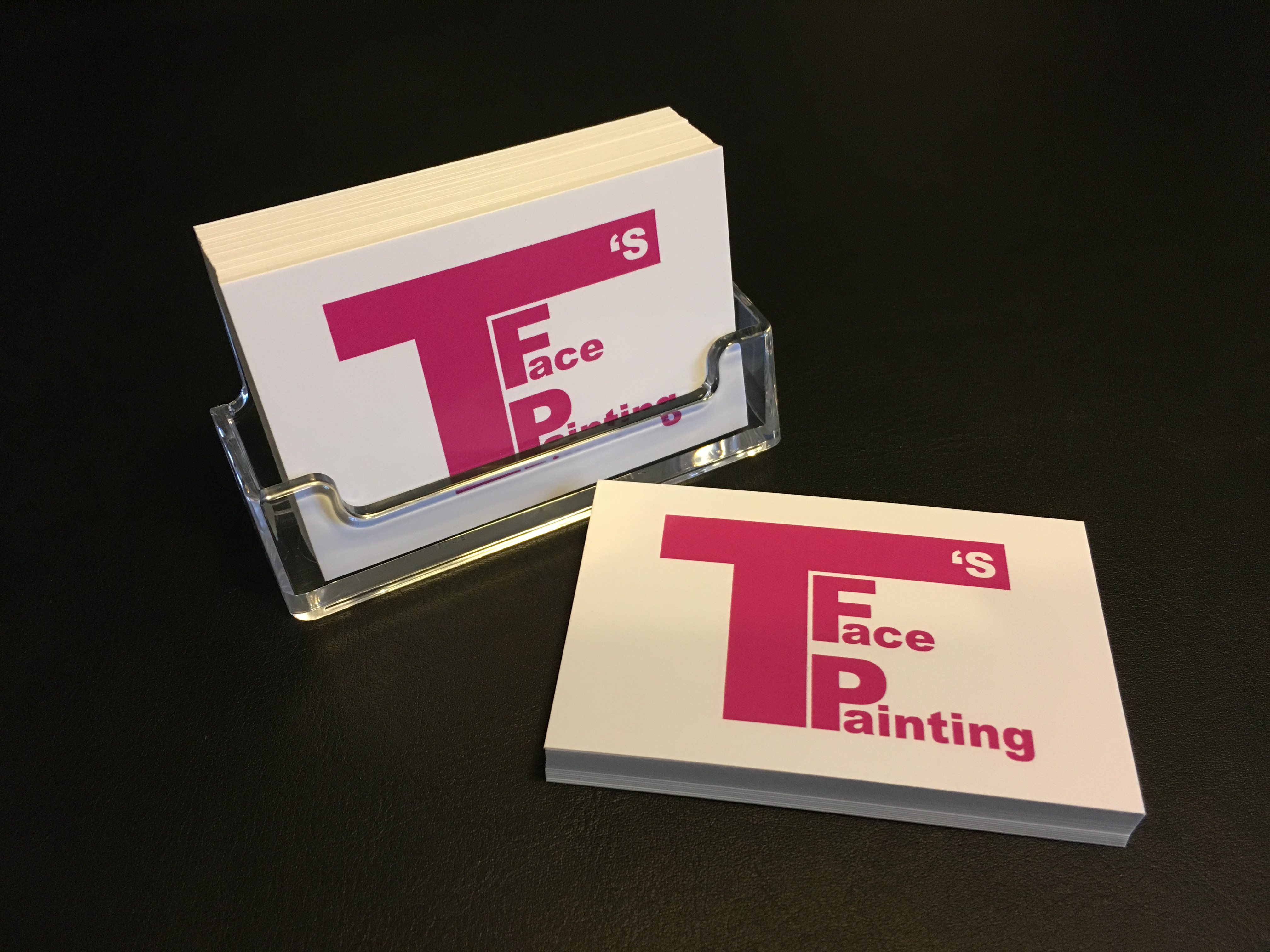
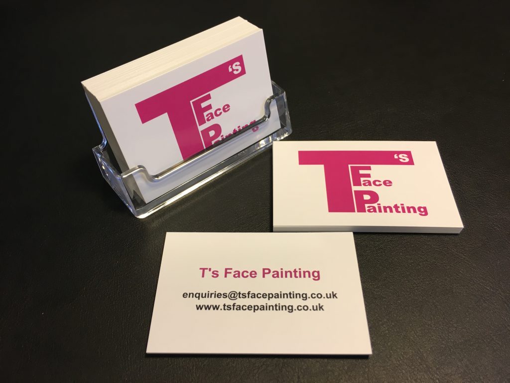
I made the business cards design very simple and clear. I also wanted to promote T’s Face Painting as a recognisable brand which I did by only display the logo on the front. On the reserve of the card I wanted to provide key information without cluttering the space, this is always challenging. There are three main pieces of information which are vital to have on a business card:
- Your name or company name
- Website
- Contact details
With the above in mind, I decided this would be the only information on the cards. So do I use my name or company name? I am getting married next year so I felt it would be best use the company name. The website details are nice and simple now I have these amazing website which I built (another one of my valuable skills). With regard to contact details, I personally prefer to be contacted via email because I can’t always answer the phone during the day.
That’s it! All I had to do then was upload the designs to VistaPrint and wait for them to arrive. Here are the results:


